AI Development

- AI Services
-

-
 Generative AI
 -
 Data Engineering
 -
 ML Development
 -
 AI Consulting Services
 -
 Chatbot Development
 -
 Computer Vision
 -
 Enterprise AI Development
 -
 AI Agent Development
 -
 LLM Development
 -
 NLP Services
 -
 RAG as a Service
 -
 AI Integration Services
 -
 AI Automation Agency
 -
 Deep Learning Development
 -
 AI Voice Agent Development
 -
 LLM Fine-Tuning
 -
 Enterprise AI Chatbot
 -
 Vibe Coding Agency
 -
 Business Intelligence Services
 -
 AI Workflow Automation
 -
 AI Visual Inspection Development
 -
 Generative AI Consulting
 -
 AI PoC Development
 -
 AI MVP Development
 -
 Mobile App Development
 -
 SaaS App Development
 -
 E-commerce Development
 -
 Web Development
 -
 Software Development
AI Services
AI-Powered Engineering Services
-
- Industries
-
 AI Solutions for FintechMerging AI technologies with
finance and financial services -
 AI Solutions for LogisticsWe build AI solutions for
Logistics service providers -
 Healthcare AI SolutionsWe build AI-powered
healthcare solutions. -
 Retail AI SolutionsGet robust retail AI solutions built
with the latest smart retail features. -
 AI Solutions for EcommerceWe build AI-powered solutions
for Ecommerce Businesses. -
 AutomotiveGet apps built to track everything
from car service to fuel economy -
 AI solutions for travelBuild AI- powered travel app
with all travel essential features -
 AI Solutions for EducationBuild an AI-powered EdTech app
that's fun, instructive, and insightful. -
 Real Estate AI SolutionsGet AI solutions for real estate
business built with the latest features. - Hire AI Developers
-
 AI Developers
 -
 Gen AI Engineers
 -
 Data Engineers
 -
 ML Engineers
 -
 Vibe Coding Experts
 -
 Python Developers
 -
 Hire Data Scientists
 -
 Prompt Engineers
Artificial Intelligence (AI) Engineers
-
- Case Studies
- Resources
- Company
-
-
-


Table of Contents
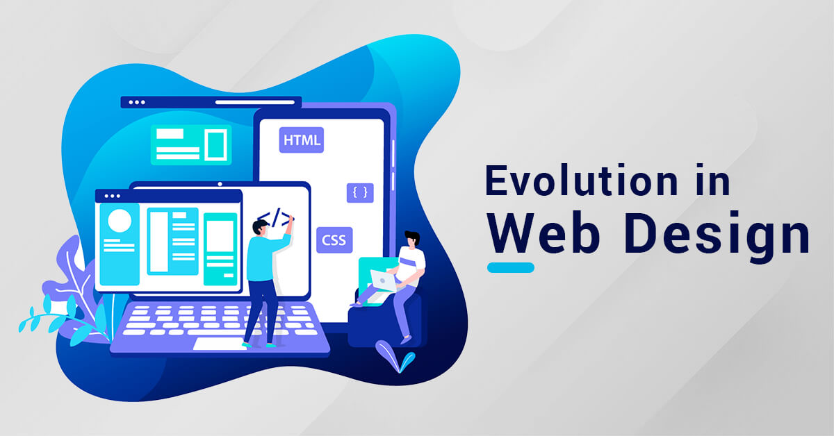
Evolution in Web Design: A Case Study of 25 Years
The term web design simply encompasses a design process related to the front-end design of website that includes writing mark-up. Creative web design has a considerable impact on your perceived business credibility and quality. It taps onto the broader scopes of web development services.
Web designing is identified as a critical factor for the success of websites and eCommerce. The internet has completely changed the way businesses and brands operate. Web design and web development go hand-in-hand and the need for a professional web design and development company, offering a blend of creative designs and user-centric elements at an affordable rate, is growing at a significant rate.
In this blog, we have focused on the different areas of designing a website that covers all the trends, tools, and techniques coming up with time.
Table of Contents
Web design
In 2020 itself, the number of smartphone users across the globe stands at 6.95 billion, with experts suggesting a high rise of 17.75 billion by 2024. On the other hand, the percentage of Gen Z web and internet users worldwide is up to 98%. This is not just a huge market but a ginormous one to boost your business and grow your presence online.
Web Design History
At a huge particle physics laboratory, CERN in Switzerland, the son of computer scientist Barner Lee published the first-ever website on August 6, 1991. He is not only the first web designer but also the creator of HTML (HyperText Markup Language). The worldwide web persisted and after two years, the world’s first search engine was born. This was just the beginning.
Evolution of Web Design over the years
With the release of the Internet web browser and Windows 95 in 1995, most trading companies at that time saw innumerable possibilities of instant worldwide information and public sharing of websites to increase their sales. This led to the prospect of eCommerce and worldwide group communications.
The next few years saw a soaring launch of the now-so-famous websites such as Yahoo, Amazon, eBay, Google, and substantially more. In 2004, by the time Facebook was launched, there were more than 50 million websites online.
Then came the era of Google, the ruler of all search engines introducing us to search engine optimization (SEO) and businesses sought their ways to improve their ranks. The world turned more towards mobile web experiences and responsive mobile-friendly web designs became requisite.
Let’s take a deep look at the evolution of illustrious brands to have a profound understanding of web design.
Here is a retrospection of a few widely acclaimed brands over the years.
Netflix
From a simple idea of renting DVDs online to a multi-billion-dollar business, saying that Netflix has come a long way is an understatement. A company that has sent shockwaves across Hollywood in the form of content delivery. Abundantly, Netflix (NFLX) is responsible for the rise in streaming services across 190 countries and meaningful changes in the entertainment industry.
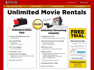
1997-2000
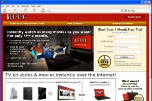
The idea of Netflix was born when Reed Hastings and Marc Randolph decided to rent DVDs by mail. With 925 titles and a pay-per-rental model, Netflix.com debuts the first DVD rental and sales site with all novel features. It offered unlimited rentals without due dates or monthly rental limitations with a personalized movie recommendation system.
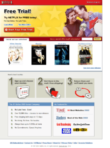
2001-2005
Announcing its initial public offering (IPO) under the NASDAQ ticker NFLX, Netflix reached over 1 million subscribers in the United States by introducing a profile feature in their influential website design along with a free trial allowing members to create lists and rate their favorite movies. The user experience was quite engaging with the categorization of content, recommendations based on history, search engine, and a queue of movies to watch.
2006-2010
They then unleashed streaming and partnering with electronic brands such as blu-ray, Xbox, and set-top boxes so that users can watch series and films straight away. Later in 2010, they also launched their sophisticated website on mobile devices with its iconic red and black themed background.
2011-2015
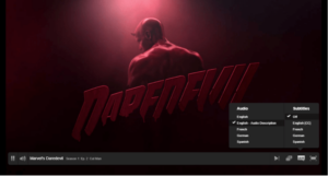
In 2013, an eye-tracking test revealed that the users didn’t focus on the details of the movie or show in the existing interface and were perplexed with the flow of information. Hence, the professional web designers simply shifted the text from the right side to the top of the screen. With Daredevil, an audio description feature was also launched for the visually impaired ones.
2016-2020
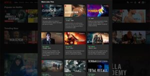
These years, Netflix came with a plethora of new features for their modern website design such as AutoPay, snippets of trailers, recommendations categorized by genre, percentage based on user experience, upcoming shows, top 10 lists, etc. These web application features yielded better results in visual hierarchy and flow of information across the website.
2021
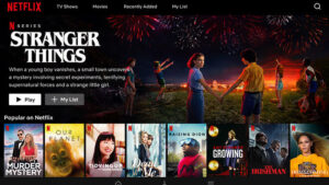
With a sleek logo in their iconic red N, timeless black background with a ‘Watch anywhere, Cancel anytime’ the color, the combination, the statement, and the leading ott platform for top video streaming service Netflix has overgrown into a revolutionary lifestyle of Netflix and Chill.
Know More: Want to know the cost of a Video Streaming App like NetFlix?
Amazon
A guy left his 9-5 job with an idea to capitalize on the growing internet and there it was the Amazon.com operating from a garage of a rented home. The guy was indeed none other than the world’s largest retailer, Jeff Bezos. Who knew this was going to turn into the internet age’s biggest success story? Let’s take a look at how it has evolved over the years:
1995-2000
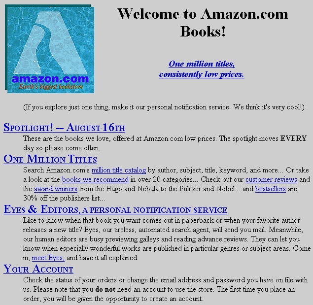
With a gray logo of a winding river flowing through a large A, earth’s biggest online bookstore was launched in July 1995. Amazon offered one million book titles with a subtle search engine and a free subscription feature of sending personal notifications. The website underwent significant changes in 1997, enhancing user experiences by adding a navigation system, reviews, book cover images, and raised $54 million in the process.
2001-2005
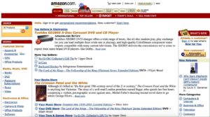
Expanding its market, Amazon launched an eCommerce website with a diverse catalog, including electronics, art and collectibles, toys and video games, lawn and patio, tools and hardware, health and beauty, software, and auctions. The signature logo of Amazon with a smiley-like arrow was the center of attention, along with bright red refined tabs.
2006-2010
This era didn’t see many changes in web design-wise just the color changes, but Amazon did streamline its services with Amazon prime and Kindle, which turned out to be a huge success. They also illustrated a personalized web page for each of the products under respective categories.
2011-2015
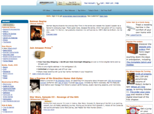
Amazon totally updated its web design look with a colorless redesign dropping all traces of bold colors in the background as well as in the borders. Later in 2015, they eliminated the left sidebar from their web design and resurfaced it behind the top navigation area with a gray background.
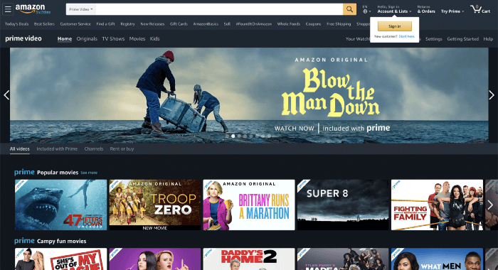
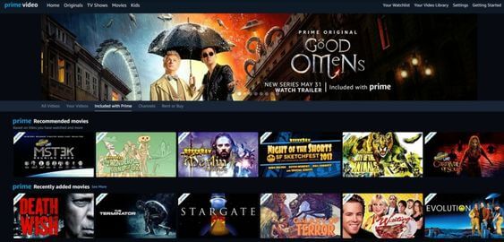
2015-2020
With fewer items on the website homepage design, Amazon, the eCommerce giant, brought its own products and services across the website. The experienced web designers took a turn towards modular web designs that were user-friendly and responsive at the same time. While advertising their own services and products, they introduced promotional banners and ads that introduced a web page full of unique products which the users may not have seen before.
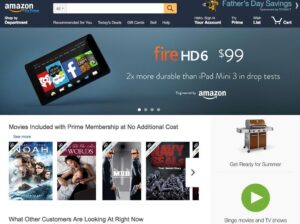
2021
Jeff Bezos is flying to space, but so is Amazon with its exciting new user interfaces and a minimalist approach, not to mention the drone-based delivery system.
GAP
With a subtle idea of making it easier to find the perfect pair of jeans, GAP was founded in 1969. The amalgamation of seven renowned brands grew globally through its online purchasing presence. Over the years, GAP has gone through a host of web design branding to reach where it is today. Let’s take a look:
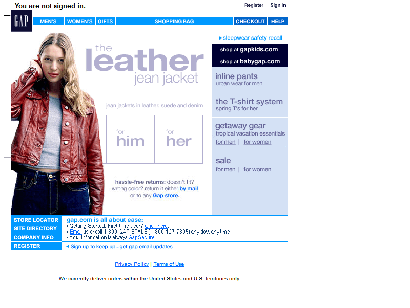
1997-2000
The aspiring website designers conveyed a pretty straightforward message right through their navigation bar. They fitted a simple layout into a small website homepage design, including GAP kids and GAP news—advertising in the top section of the website with a subtle GAP logo in the top left corner. In 2000, GAP came up with a borderless web design, restructuring the entire webpage. This colorless web page included exciting new features such as easy returns, a site directory, and a store locator.
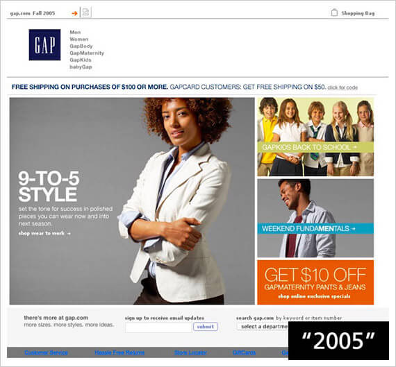
2000-2005
With an enchanting summer vibe across the homepage of the website, GAP successfully persuaded visitors that they have come up with a new website design that includes a bright yellow vertical box of navigation alongside an image. Later in 2005, giving more prominence to the navigation bar, they changed its position by encapsulating it back at the top right corner of the website page.
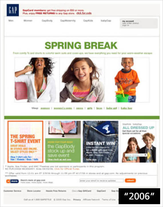
2006-2010
Expanding its global presence, GAP includes more sections underneath the banner on the web design. Staying in the symmetric layout, this time, they added new colors adjusting to the spring. After a year or two, GAP moved its focus towards gap kids and added cute photos of kids on the homepage of their website with a navigation bar on the left.
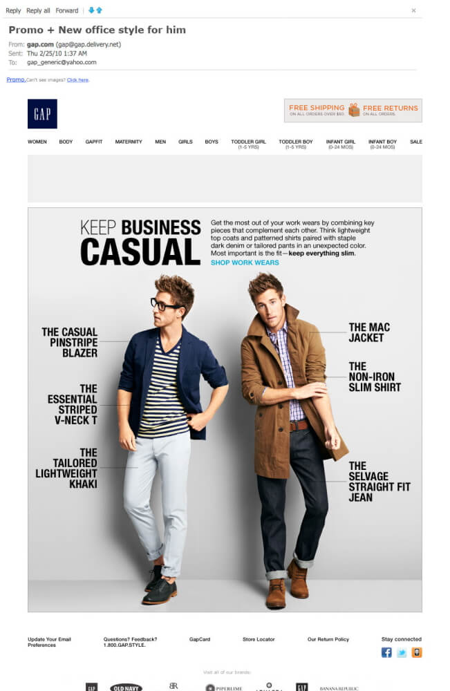
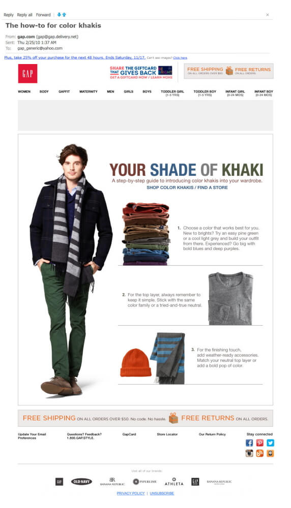
2011-2015
GAP comes up with digital strategies and on-page enhancements to strengthen their connections with customers shopping online through richer user experiences. This definitely fueled their long-term goal of attracting more customers. GAP transformed its product operating model and combined responsive web design structures to market trends such as business casuals and khaki.
2015-2020
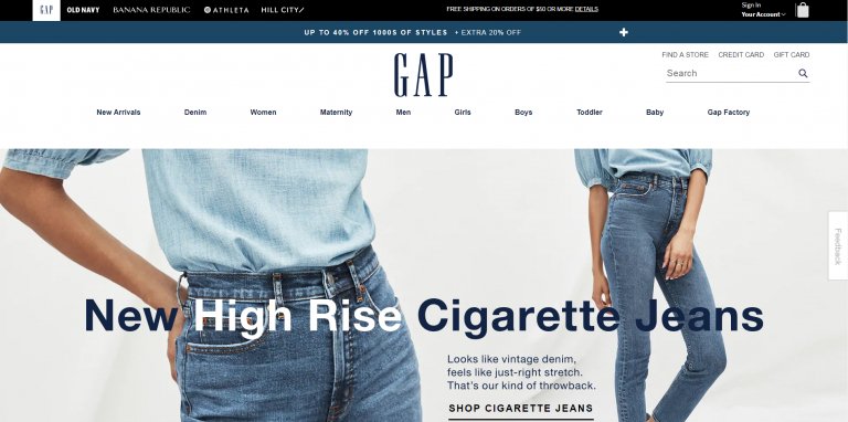
Allowing visitors to find what they are looking for, GAP kept its navigation bar right next to its classic logo in the top left corner in their modern web design. In 2019, GAP changed the position of its signature logo from the top right corner to the middle. This gave the entire online shopping website a sleek look with just basic blue, gray and white color combinations. In 2020, GAP shifted to the digital-first strategy; thanks to the pandemic in just a year, its online sales grew to 54%.
2021
San Francisco-based GAP Inc. is now driven by a 95% surge in online sales. GAP has undoubtedly mastered the art of advertising its products on their online shopping website from all possible perspectives, attracting more and more visitors with their lifestyle-infused photography every day.
Popular Web Designing Tools
With better web development, web designing tools are progressively getting better and more accessible for best web designers to use. There are so many website designing tools to help you with frameworks, mocking, prototyping, testing, animation, content, layouts, and many other elements. We have rounded up some of the best tools right now that will help to design a website for your online business:
- In Vision studio
- Photoshop
- Proof hub
- Sketch
- Adobe XD
- Figma
- Proto.io
- Axure
- Bootstrap
- Canva
- ARKit
- Adobe Dreamweaver
- Bluefish
- Google web designer
Choosing the right tech stack for your website can be soporific, visit Guidelines to help you choose the best Tech Stack for your website for tips and guidance for understanding the web development stack.
Latest Web Design Techniques
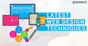
Fifty milliseconds (0.05 seconds) are all it takes for a user to form an opinion about your website, whether they like it or not, whether they will stay or leave. Web designs are subject to snap judgments at some levels that instantly influence the perspective of a person, so your web design must be aesthetically pleasing. Here are few techniques represented to achieve effective as well as responsive web designs:
There are a lot of techniques evolving across the web development services regarding the malicious code that should be kept in mind. The tendency to breach security issues is tackled by securing the web browsers to grow through the different aspects of NDA and security breaches across the web platforms. This helps in focusing on the things that drive more and more customers to the website.
Fluid Grid Layout
Usually, a website is built in a grid-based layout using HTML tables or divs. Earlier in the grid layout style the width was fixed, but as the number of devices with varying screen sizes increased there was a need to opt for styling that would suit the user’s devices.
Responsive web design was the solution to this and was applied on the website grid layout to enable it to be viewed hassle-free on multiple devices by specifying percentage-based dimensions to the web page grid or based on the device’s screen change the display pattern to suit the user’s screen. For instance, the content displayed from left to right was then displayed on smaller screen sizes in a top-to-bottom fashion. This allows that part to resize or reorganize based on the current viewing size.
Flexible images and media
The human brain takes just 13 milliseconds to process an entire image, so you have to make sure the images on your website convey a strong message. Images or media subject to the web pages will automatically resize or crop regarding the current viewing device size or resolution in this RWD (Responsive Web Design) technique. It can be done either by using relative dimensions such as the grid layouts, cropping extra parts of an image in smaller screen sizes, or even completely hiding an image as the screen size dwindles.
CSS media queries and screen resolution
CSS media queries bring out subtle modifications of a website even if they are in a single style sheet. Using this responsive web design technique, you can provide single or multiple fixed versions of an element for screen resolution ranges.
Navigation system
An effective navigation system is user-friendly and supports all search preferences to engage more and more visitors to your website. To keep in mind while designing a website, users can easily navigate the information they are looking for to keep their interest alive. Keeping the target audience in mind ensures that your site has an intuitive and straightforward navigation system.
Top Web Design Trends
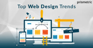
Over the past ten years, website design trends have drastically changed especially when it comes to homepage designs. Website designing has a history of improving with time and has improved into something elaborate setting into a completely different era. Web design trends have come a long way, from flashing graphics and scrolling marquees to subtle and minimalist designs. Here are some of the hottest trends in the world of modern web designs:
AR and VR Technologies
Rather than sticking to the grid, web design trends involve thinking outside the box. With augmented reality and virtual reality, it is quite literally possible. By blending both digital and physical worlds, AR has come up with real-world and object-related approaches. Especially in the gaming department, VR has seen a lot of progress as it enhances the user experience by creating virtual spaces.
Neumorphism
Combining material designs and skeuomorphism, Neumorphism has emerged and created a lot of buzz among web design interfaces. Neumorphism is all about flat designs with simplified icons or symbols mimicking real-life buttons in a simple yet realistic way. They are conveyed as a raised shape made from a very similar material as the background giving an effect of floatation.
Chatbots
Made of text, images, and animations, the best web designing service providers are gushing over this trend. Chatbots create a very human-like and screen-based interaction with graphical elements venturing into the uncharted territory of conversational user interface (CUI). After a fully designed website, deploying a chatbot is just the cherry on the cake.
Dark mode
It is no secret that black is one of the most loved colors. Website visitors are completely digging the dark mode and low light interfaces. Dark themes consume a lot less battery power and are easy on the eyes. Along with giving an ultra-modern look, it also highlights other design elements.
Photography
Website visitors are no longer looking for cheesy glamour shots; instead, they look for personality, story, and originality portrayed on websites. Dry stock photos with dull white backgrounds are certainly not in vogue. Using meaningful images on your website that transmits a message subconsciously to your audience is something to think about. So, invest in professional photography and see your website boost up.
3D Technology
3D is one of the most engaged trends in web designing services as it gives an exciting and captivating feel to website visitors. Expert web designers are certainly thinking out of the traditional X and Y-axis when it comes to user interface concepts. They are coming up with a whole new perspective of adding animated 3D elements such as logos, texts, and illustrations to outshine the competitors with their web design.
Frosted glass effects
It gives a blurry, semi-transparent look of one element behind another, frosted glass effects add a classy touch to the web design. It is used to develop a visual hierarchy and add depth to the surfaces with translucent shapes, vivid colors, and modern fonts.
Retro aesthetics
Retro hits from the ’90s are not just giving a comeback in the music industry but also trending across web design services. The contrast in font sizes, exaggerated headline fonts, eye-catching typography, bold animations, and asymmetric layouts seem to impact visitors across the web. Along with being aesthetically pleasing, the unpolished, raw looks that marked the entire era are once again considered fierce and omnipresent.
Scroll-triggered animation
Storytelling through scroll-triggered animation harvests the power of UX writing by narrating engaging content for a great user experience. Adding a deeper layer of meaning to the website experience, this multimedia approach hooks the user and prompts them to scroll further. Innovatively, it illuminates things words can’t cover by making the visitor feel like an active participant of your website.
Thumb-friendly navigation
It is vital that your website functions well on mobile phones and is easy to use. Skilled web designers are coming up with reliable and comfortable options with thumb-friendly navigation for a unique hassle-free user experience. It simply involves putting the critical elements of your website, such as the menu and navigation bars, in the space our thumb can reach.
Minimalism
One thumb rule of web design: Quality over quantity, always. Whether it’s furniture, fashion, or web designs, people develop a strong interest in minimalism. It allows users to concentrate on the more important things by simplifying interfaces and removing unnecessary elements or content that does not support the fundamental purpose of the website. Minimalist web designs also help in boosting SEO as they are easy for search engine bots to crawl.
Web accessibility
Nearly 1 in 7 people are disabled, with more than 2 billion disabled people across the world. Simply put, web accessibility means designing your platform so that all kinds of audiences can access it, even people with specific disabilities. Web accessibility is a trend and an essential factor that is critical to consider while designing your website.
Personalized call to action
Web designers are now on the lookout for interesting and creative call-to-action buttons. These captivating buttons encourage the website visitors to click on the link and visit it. The time of boring ‘Contact us’ buttons is gone. Now the more enchanting the Call-to-Action button is, the more likely the website visitor is to click on it. CTA is simply a fun combination of animations and colors to show actionable items.
Why websites are integral part of startup business?
Final observation
Having a reasonably recent history, top web designers have conquered the digital world with their branded web designs. Websites have become a crucial part of our everyday lives, to the extent that it is hard to imagine the internet without animation, audio, videos, and typography. These elements play an integral role in the growth of your business as it highly impacts how the audience perceives your brand.
The stakes have never been higher for professional businesses that intend to grow in web design. The Tech world is constantly evolving, and it is fair to say that online website credibility is hard-won and easily lost.
With in-depth knowledge in International Business Management and Information Technology, he can effectively craft business enhancement strategies and can skillfully untangle technical complexities. This has laid the path for him as the Co-Founder and MD of Prismetric . Writing about the new age technology and sharing his thoughts on the continuously evolving business trends keep him content.
Our Recent Blog
Know what’s new in Technology and Development

14+Years’ Experience in IT
Prismetric Success Stories
0+
Happy Clients
0+
Solutions Developed
0+
Countries
0+
Developers